
Within Dynamics 365, commands offer the ability to define actions that users or automation can initiate. Power Fx can be utilized within these commands to articulate the desired outcomes when a command is executed. For instance, Power Fx can be applied to generate dynamic notifications, modify records, dispatch emails, or conduct calculations in reaction to user interactions.
Before the advent of the command designer, incorporating custom buttons into a Dynamics form or grid was a cumbersome task. Previously, it required reliance on third-party plugins like Ribbon Workbench to tailor ribbon buttons and their functionalities to your needs. However, with the introduction of the command designer, the process has become much more straightforward, allowing you the flexibility to include them seamlessly as part of your solution, eliminating the hassle.
To add a command bar using the Command Designer, follow these steps:
Open the Command Designer to modify a command bar.
- In the App Designer, choose any table from the Pages area.
- Select “…” (ellipsis), and then click “Edit command bar.”
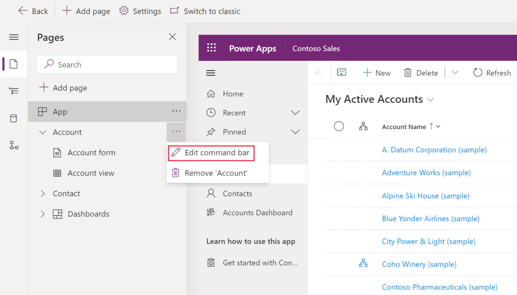
- Choose the location where you want the command bar to appear and click “Edit.” (For more information about command bar locations, refer to “Command bar locations.”)

Create a new command
Open the Command Designer to edit a command bar, then click “+ New Command” to create a new command.
- On the right pane, provide or select the following options:
- Label (optional): Enter a label to display on the command button.
- Icon: Choose an icon for the command button from system icons or web resource SVG files. To upload your own icon, select “Web resource,” upload an SVG file, and then click “Save” and “Publish” the web resource. For guidance on creating a web resource for your icon, refer to “Create or edit model-driven app web resources to extend an app.”
- Action: Select from “Run formula” (Power Fx formula) or “JavaScript” (JavaScript library and command) to define the command action.
- Visibility: Specify whether to “Show the command button” or “Show on condition from formula.”
- Tooltip title (optional): Enter a tooltip title for the user when they hover their mouse over the command.
- Tooltip description (optional): Provide a tooltip description that appears beneath the tooltip title when users hover over the command.
- Accessibility text (optional): Input text to be read by screen readers.
- Order number: Define the command’s display order concerning other commands within the same command bar.
- Drag and drop the command to your desired location, arranging modern commands alongside classic ones.
- Click “Save and Publish” to make the command available to app users.
- To test your changes, click “Play” to run the app and see the command in action.
Add command to the solution
Now that you’ve successfully added the command, let’s explore how to package it into the solution. The Command Designer utilizes an external canvas app known as “Command Libraries,” and each button is added as a command in the “Table Sub-Components” section.
When you add the model-driven app to your solution, it includes the Command Library, but it does not automatically include the individual commands. Therefore, it’s essential to ensure that when you add your table to the solution, you select the required commands as well. This step is crucial to ensure that your button becomes available in the target environment after deployment.

 My Trial