
Power Apps grids are a versatile tool that allows users to view and edit data in a table format within a Power App. There are several customizable properties included with the control that let users tailor the grid experience for that table.
To modify any of these properties, select Edit in the corresponding row, and then change the value using the dropdown list under Bind to static options.
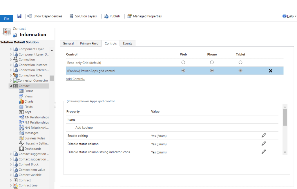
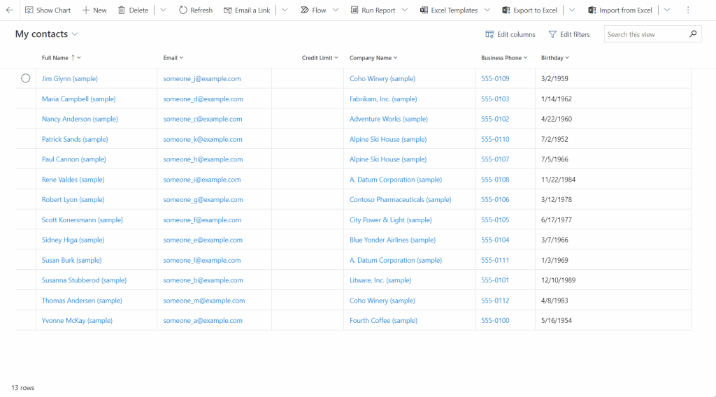
The first property, Enable editing, determines whether the grid is read-only or editable. By default, the value is set to No, but users can select Yes to make the grid editable. Editable grids are visually indicated by vertical lines between columns.
The next property, Enable filtering, determines if filtering options are available to users in the grid column header dropdowns. The default value is Yes, but users can change it to No to disable filtering.
The Allow range selection property controls whether users can select a subset of the grid and copy that data to another application like Excel. The default value is Yes, but users can change it to No to prevent range selection.

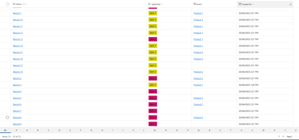
The Enable jump bar property can be used to display an alphabetic list at the bottom of views or subgrids. The default value is No, but users can select Yes to enable the jump bar.
The Enable pagination property can be used to decide between modern data browsing (infinite scroll) and paging buttons. The default value is No, but users can select Yes to disable infinite scrolling and surface paging buttons. Note that the Select all action isn’t available currently when using infinite scroll, but users can still perform range selection.
The Enable OptionSet colors property can be used to increase the visual appeal of choice columns by showing each value with its configured background color. The default value is No, but users can select Yes to enable the color display. However, users must ensure that the configured color for each choice column is readable and accessible before enabling this property for a table.
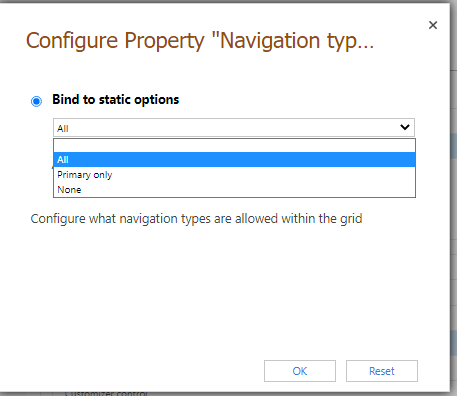
Lastly, the Navigation types allowed property determines which lookup controls in the grid render as hyperlinks. The default value is All, but users can select Primary only to suppress hyperlinks on all lookup fields except the primary column for the selected entity.
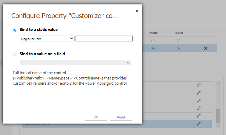
The Customizer control property is also available to link to a single customizer PCF control with definitions for changing the visuals or interactions for one or more columns in the grid.
By customizing these properties, users can enhance their experience while viewing and editing data using the Power Apps editable grid control.
 My Trial